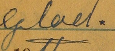
This kind of resolution is fantastic for resolving illegible words — from my testing, it seems to be as good or better than using a magnifying glass on the original documents. Unfortunately these original files are unwieldy: it takes a very long time to download the image to the browser, and once downloaded, displaying the files in a UI useful for transcription is basically impossible.

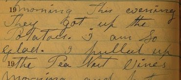
As a result, I'm shrinking the page images down by a quarter when they're added to the system. The resulting image is legible without much squinting. (See the sample above.)
These 480x640 images take up about half of the average modern monitor, so they're suited very well for a UI positioning the image on the right half of a webpage, with the textarea for transcriptions on the left half. They're also reasonably quick to load, even over a slow connection. They're not quite clear enough to resolve difficult handwriting, however, nor problems with the lighting when I took the original pictures. For that, we need to zoom.
In the original mockup created by my friend Blake Freeburg, as well as in the first prototype I wrote two years ago, a link appeared on the transcription page that reloaded the page with a higher resolution image. This provided access to the larger image, but had the same disadvantages (long wait time, ungainly UI) that comes along with larger image files.
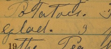
The solution I've come up with is to provide a click-to-zoom interface. If a scribe can't read a part of the original, they click on the part they can't read. That will fire off an AJAX request including the coordinates they clicked. The server finds the next-larger-size image, crops out the section around the click target, and returns it to the browser. That will fire off an onComplete callback function to swap the standard-size image with the cropped version.

So in my example above. clicking the space after "glad." would return second image above. The user could then click an "unzoom" icon to return to the original low-resolution, full-page image, or click on the zoomed image to zoom again.

This would be the result of clicking on the zoomed word "glad" in the zoomed (second) image. This is a cropped version of the original five-megapixel image, and I think it's just as readable as the original document.
The advantages of this approach are a consistent UI and lower download times. Since some of my target users are rural or elderly, download time is a big plus.
The disadvantages come from possible need to pan around the zoomed image. My old colleague Prentiss Riddle has suggested using the Google Maps platform to provide tiled panning. This sounds elegant, but is probably hard enough to postpone until I have actual user feedback to deal with. There's also the possiblity that the server load for doing all that image manipulation will produce slow response times, but it's hard for me to imagine that the 45 sec needed to crop an image would take longer than downloading 1.5MB over a dialup connection.
No comments:
Post a Comment