Tuesday, November 13, 2007

Podcast Review: Matt Mullenweg at 2006 SF FOWA

Matt Mullenweg is an incredible speaker -- I've started going through the audio of every talk of his I can find online. His presentation at the 2006 Future of Web Apps (mp3, slides) is a review of the four projects he's worked on, and the lessons he's learned from them. It's a fantastic pep talk, and it's so meaty that I sometimes thought editing glitches had chopped out the transitions from one topic to another.

I see five take-aways for my project:

  1. Don't think you aren't building an API. If things go well, other developers will be integrating your product into other systems, re-skinning it, writing plug-ins, or all of these. You'll be exposing internals of your app in ways you'll never imagine. If your functions are named poorly, if your database columns are inconsistently titled, they'll annoy you forever.

  2. While you shouldn't optimize prematurely, try to get your architecture to "two" as soon as you can. What does "two" mean? Two databases, two appservers, two fileservers, and so on. Once that works, it's really easy to scale each of those to n as needed.

  3. Present a "Contact Us" form somewhere the public can access it. Feedback from users who aren't logged in exposes a wide range of problems you don't get through integrated feedback tools.

  4. Avoid options wherever possible.

    Presenting a site admin with an option to do X or Y is a sort of easy way out -- the developer gets to avoid hard decisions, the team gets to avoid conflict. But options slow down the user, and most users never use a fraction of the optional features an app presents. Worse, the development effort is diffused forever forward -- an enhancement to X requires the same effort to be spent on Y for consistency's sake.

    Plugins are the solution for user customization. Third-party plugins don't diffuse the development effort, since the people who really care about the feature spend their time on the plugin, while the core app team spend their efforts on the app.

  5. The downside of plugins and themes is that you need to provide a way for users to find them. If you create a plugin system, you need to create some sort of plugin directory to support it.

Sunday, October 21, 2007

Podcast Review: "When Communities Attack!"

As predicted earlier, real life has consumed 100% of my energy for the last month or so, so I haven't made any progress on RefineScript/The Straightstone System/curingbarn.com/ManuscriptForge. I have, however, listened to some podcasts that I think are relevant to anyone else in my situation*, so I think I'll start a series of reviews.

"When Communities Attack!" was presented at SXSWi07 by Chris Tolles, marketing director for Topix.net. You can download the MP3 at the SXSW Podcast website.

The talk covered the lessons learned about online communities through running a large-scale current-events message board system. Topix.net really seemed like it had been a crucible for user-created content, as Danish users argued with Yemenis about the Mohamed cartoons, or neighbors bickered with each other about cleaning up the local trailer park.

These were the points I thought relevant to my comment feature:
  • Give your site a purpose and encourage good behavior. Rather than discourage bad behavior, if your site has a purpose (like wikipedia) users have a metric to use to police themselves. Even debatable behavior can be tested against whether it helps transcribe the manuscript. This also prevents administrators from only acting as nags.
  • Geo-tag posts. Display the physical location where the comment comes from: "The commentary now autotags where the commenter is from. . . . The tone of the entire forum got a little more friendly once you start putting someone's town name next to [a post], because it turns out that no-one wants to bring shame to their town.
  • Anonymity breeds bad behavior. If people think their mother will read what they're writing, they're less likely to fly off the handle.
  • Don't erect time-consuming barriers to posting. It turns out that malevolent users have more free time than constructive users, and are actually more likely to register on the site and jump through hoops.
  • Management needs a presence. Like a beat cop, just making yourself visible encourages good behavior.
  • Expose user information like IP address. This can help the community police itself through shaming posters who use sock-puppet accounts.
[*] that is, any other micro-ISV building on collaboration software for the digital humanities.

Sunday, October 14, 2007

Matt Unger in the New York Times

Papa's Diary Project got a nice write up in today's New York Times.

I especially like that it's filed under "Urban Studies | Transcribing".

Tuesday, October 2, 2007

Name Update: Renan System pro and con

I've been referring to the software as the "Renan System" for the past few months. The connection to Julia Brumfield's community works well, and Google returns essentially nothing for it. The name is both generic and unique, so I registered renansystem.com.

There's just one problem: nobody can pronounce it.

The unincorporated community of Renan, Virginia is pronounced /REE nan/ by the locals, which occasionally gets them some kidding. I now understand why they say it that way - it's just about the only way to anglicize the word. /ray NAW/ is hard to say even if you don't attempt the voiced velar fricative or nasalized vowel. Since the majority of my hypothetical users will encounter the word in print alone, I have no idea how the pronunciation would settle out.

So unless there's some standard for saying "Renan" that I'm just missing, I'll have to start my name search again.

Friday, September 21, 2007

Progress Report: Printing

I just spent about two weeks doing what's known in software engineering as a "spike investigation." This is somewhat unusual, so it's worth explaining:

Say you have a feature you'd like to implement. It's not absolutely essential, but it would rank high in the priority queue if its cost were reasonably low. A spike investigation is the commitment of a little effort to clarify requirements, explore technology choices, create proof-of-concept implementations, and (most importantly) estimate costs for implementing that feature. From a developer's perspective you say "Pretend we're really doing X. Let's spend Y days to figure out how to do it, and how long that would take." Unlike other software projects, the goal is not a product, but 1) a plan and 2) a cost.

The Feature: PDF-download
According to the professionals, digitization projects are either oriented towards preservation (in which case the real-life copy may in theory be discarded after the project is done, but a website is merely a pleasant side-effect) or towards access (in which distribution takes primacy, and preservation concerns are an afterthought). FromThePage should enable digitization for access — after all, the point is to share all those primary sources locked away in somebody's file cabinet, like Julia Brumfield's diaries. Printed copies are a part of that access: when much of the audience is elderly, rural, or both, printouts really are the best vehicle for distribution.

The Plan: Generate a DocBook file, then convert it to PDF
While considering some PDF libraries for Ruby, I was fortunate enough to hear James Edward Gray II speak on "Ruby as a Glue Language". In one section called "shelling out", he talked about a requirement to produce a PDF when he was already rendering HTML. He investigated PDF libraries, but ended up piping his HTML through `html2ps | ps2pdf` and spending a day on the feature instead of several weeks. This got me looking outside the world of PDF-modifying Ruby gems and Rails plugins, at other documenting scripting languages. It makes a lot of sense — after all, I'm not hooking directly to the Graphviz engine for subject graphs, but generating .dot files and running neato on them.

I started by looking at typesetting languages like LaTeX, then stumbled upon DocBook. It's an SGML/XML-based formatting language which only specifies a logical structure. You divide your .docbook file into chapters, sections, paragraphs, and footnotes, then DocBook performs layout, applies typesetting styles, and generates a PDF file. Using the Rails templating system for this is a snap.

The Result:
See for yourself: This is a PDF generated from my development data. (Please ignore the scribbling.)

The Gaps:
  • Logical Gaps:
    • The author name is hard-wired into the template. DocBook expects names of authors and editors to be marked up with elements like surname, firstname, othername, and heritage. I assume that this is for bibliographic support, but it means I'll have to write some name-parsing routine that converts "Julia Ann Craddock Brumfield" into "<firstname> Julia </firstname> <othername type="middle"> Ann </othername> <othername type="maiden"> Craddock </othername> <surname> Brumfield </surname>".
    • There is a single chapter called "Entries" for an entire diary. It would be really nice to split those pages out into chapters based on the month name in the page title.
    • Page ranges in the index aren't marked appropriately. You see "6,7,8" instead of "6-9".
    • Names aren't subdivided (into surname, first name, suffix, etc.), and so are alphabetized incorrectly in the index. I suppose that I could apply the name-separating function created for the first gaps to all the subjects within a "Person" category to solve this.
  • Physical Layout: The footnote tags are rendering as end notes. Everyone hates end notes.
  • Typesetting: The font and typesetting betrays DocBook's origins in the world of technical writing. I'm not sure quite what's appropriate here, but "Section 1.3.4" looks more like a computer manual than a critical edition of someone's letters.
The Cost:
Fixing the problems with personal names requires a lot of ugly work with regular expressions to parse names, amounting to 20-40 hours to cover most cases for authors, editors, and indices. The work for chapter divisions is similar in size. I have little idea how easy it will be to fix the footnote problem, as it involves learning "a Scheme-like language" used for parsing .docbook files. Presumably I'm not the first person to want footnotes to render as footnotes, so perhaps I can find a .dsssl file that does this already. Finally, the typesetting should be a fairly straightforward task, but requires me to learn a lot more about CSS than the little I currently know. In all, producing truly readable copy is about a month's solid work, which works out to 4-6 months of calendar time at my current pace.

The Side-Effects:
Generating a .docbook file is very similar to generating any other XML file. Extending the printing code for exporting works in TEI or a FromThePage-specific format will only take 20-40 hours of work. Also, DocBook can be used to generate a set of paginated, static HTML files which users might want for some reason.

The Conclusions:
It's more important that I start transcribing in earnest to shake out problems with my core product, rather than delaying it to convert end notes to footnotes. As a result, printing is not slated for the alpha release.

Thursday, September 20, 2007

Money: Projected Costs

What are the costs involved making FromThePage a going concern? I see these five classes of costs:
  • DNS
  • Initial hosting bills
  • Marginal hosting fees associated with disk usage, cpu usage, or bandwidth served
  • Labor by people with skills neither Sara nor I possess
  • Labor by people with skills that Sara or I do possess, but do not have time or energy to spend
I can predict the first two with some degree of accuracy. I've already paid for a domain name, and the hosting provider I'm inclined towards costs around $20/month. When it comes to the cost of hosting other people's works for transcription, however, I have no idea at all what to expect.

I have started reading about start-up costs, and this week I listened to the SXSW panel "Barenaked App: The Figures Behind the Top Web Apps" (podcast, slides). What I find distressing about this panel is that the figures involved are so large: $20,000-$200,000 to build an application that costs $2000-$8000 per month for hardware and hosting! It's hard to figure out how comparable my own situation is to these companies, since I don't even have a paid host yet.

This big unknown is yet another argument for a slow rollout — not only will alpha testers supply feedback about bugs and usability, the usage patterns for their collections will give me data to figure out how much an n-page collection with m volunteers is likely to increase my costs. That should provide about half of the data I need to decide on a non-commercial open-source model versus a purely-hosted model.

Wednesday, September 19, 2007

Progress Report: Subject Categories

It's been several days since I updated this blog, but that doesn't mean I've been sitting idle.

I finished a basic implementation of subject categories a couple of weeks ago. I decided to go with hierarchical categories, as is pretty typical for web content. Furthermore, the N:N categorization scheme I described back in April turned out to be surprisingly simple to implement. There are currently three different ways to deal with categories:

  1. Owners may add, rename, and delete categories within a collection.
  2. Scribes associate or disassociate subjects with a category. The obvious place to put this was on the subject article edit screen, but a few minutes of scribal use demonstrated that this would lead to lots of uncategorized articles. Since transcription projects that don't care about subject indexing aren't likely to use the indexes anyway, I added a data-cleanup step to the transcription screen. Now, whenever a page contains a new, uncategorized subject reference, I display a separate screen when the transcription is saved. This screen shows all the uncategorized subjects for that page, allowing the scribe to categorize any subjects they've created.
  3. Viewers see a category treeview on the collection landing page as well as on the work reader. Clicking a category lists subjects for that category, and clicking the subject link lists links to navigate to the pages referring to that subject.
The viewer treeview presents the most opportunities, thus the most difficulties from a UI perspective. Should a subject link load the subject article instead of the page list? Should it refer to a reader view of pages including that subject? When viewing a screen with only a few pages from one work, should the category tree only display terms used on that screen, or on the work, or on all works from the collection the work is a part of? I'm really not sure what the answer is. For the moment, I'm trying to achieve consistency at the cost of flexibility: the viewer will always see the same treeview for all pages within a collection, regardless of context.

Future ideas include:
  • Category filtering for subject graphs -- this would really allow analysis of questions like "what was the weather when people held dances?" without the need to wade through a cluttered graph.
  • Viewing the text of all pages that contain a certain category on the same page, with highlighting of the term within that category.

Tuesday, September 11, 2007

Feature: Comments (Part 2: What is commentable?)

Now that I've settled on the types of comments to support, where do they appear? What is commentable?

I've given a lot of thought to this lately, and have had more than one really good conversation about it. In a comment to an earlier post, Kathleen Burns recommended I investigate CommentPress, which supports annotation on a paragraph-by-paragraph level with a spiffy UI. At the Lone Star Ruby Con this weekend, Gregory Foster pointed out the limitations of XML for delimiting commentable spans of text if those spans overlap. As one door opens, another one closes.

What kinds of things can comments (as broadly defined below) be applied to? Here's my list of possiblities, with the really exciting stuff at the end:
  1. Users: See comments on user profile pages at LibraryThing.
  2. Articles: See annotations to article pages at Pepys' Diary.
  3. Collections: Since these serve as the main landing page for sites on FromThePage, it makes sense to have a top-level discussion (albeit hidden on a separate tab).
  4. Works: For large works, such as the Julia Brumfield diaries, discussions of the work itself might be appropriate. For smaller works like letters, annotating the "work" might make more sense than annotating individual pages.
  5. Pages: This was the level I originally envisioned for comment support. I still think it's the highest priority, based on the value comments add to Pepys' Diary, but am no longer sure it's the smallest level of granularity worth supporting.
  6. Image "chunks": Flickr has some kind of spiffy JavaScript/DHTML goodness that allows users to select a rectangle within an image and post comments on that. I imagine that would be incredibly useful for my purposes, especially when it comes to arguing about the proper reading of a word.
  7. Paragraphs within a transcription: This is what CommentPress does, and it's a really neat idea. They've got an especially cool UI for it. But why stop at paragraphs?
  8. Lines within a transcription: If it works for paragraphs, why not lines? Well, honestly you get into problems with that. Perhaps the best way to handle this is to have comments reference a line element within the transcription XML. Unfortunately, this means that you have to use LINE tags to be able to locate the line. Once you've done that, other tags (like my subject links) can't span linebreaks.
  9. Spans of text within a transcription: Again, the nature of XML disallows overlapping elements. As a result, in the text "one two three", it would be impossible to add a comment to "one two" and a different comment to "two three".
  10. Points within a transcription: This turns out to be really easy, since you can use an empty XML tag to anchor the comment. This won't break the XML heirarchy, and you might be able to add an "endpoint" or "startpoint" attribute to the tag that (when parsed by the displaying JavaScript) would act like 8 or 9.

Feature: Comments (Part 1: What is a comment?)

Back in June, Gavin Robinson and I had a conversation about comments. The problem with comments is figuring out whom they're directed to. Annotations like those in Pepys' Diary Online are directed towards both the general public and the community of Pepys "regulars". Sites built on user-generated content (like Flickr, or Yahoo Groups) necessitate "flag as inappropriate" functionality, in which the general public alerts an administrator of a problem. And Wikipedia overloads both their categorization function and their talk pages to flag articles as "needing attention", "needing peer-review", or simply "candidates for deletion".

If you expand the definition of "comments" to encompass all of these — and that's an appropriate expansion in this case, since I expect to use the same code behind the scenes — I see the following general types of comments as applicable to FromThePage documents:
  1. Annotations: Pure annotations are comments left by users for the community of scribes and the general public. They don't have "state", and they don't disappear unless they're removed by their author or a work owner. Depending on configuration, they might appear in printed copies.
  2. Review Requests: These are requests from one scribe to another to proofread, double-check transcriptions, review illegible tags, or identify subjects. Unlike annotations, these have state, in that another scribe can mark a request as completed.
  3. Problem Reports: These range from scribes reporting out-of-focus images to readers reporting profane content and vandalism. These also have state, much like review requests. Unlike review requests, they have a more specific target — only the work owner can correct an image, and only an admin can ban a vandal.

Friday, August 31, 2007

Progress Report: Layout, Usability, and Collections

I've gotten a lot done on FromThePage over the last month:
  • I finished a navigation redesign that unites the different kind of actions you can take on a work, a page, or a subject article around those objects.
  • I added preview and error handling functionality to the transcription screen
  • We — well, Sara actually — figured out an appropriate two-column layout and implemented stylesheets based on Ruthsarian Layouts and Plone Clone.
  • Zoomable page images now appear in the page view screen in addition to the transcription screen.
  • I created a unififed, blog-style work reader to display transcriptions of multiple pages from the same work. This replaces the table of contents as the work's main screen, a change I think will be especially useful for letters or other short works.
  • "About this Work" now contains fields suggested by the TEI Manuscript Transcription guidelines tracking document history, physical description, etc.
  • Scribes can now rename subjects, and all the links embedded within transcription text will be updated. This is an important usability features, since you can now link incomplete terms like "Mr Edmonds" with the confidence that the entry can be corrected and expanded upon later research.
  • Full subject titles are expanded when the mouse pointer hovers over links in the text: i.e. "Josie" (try it!).
  • Works are now aggregated into collections. Articles are no longer global, but belong to a particular collection. This prevents work owners with unrelated data from seeing each other's articles if they have the same titles. Collection pages could also serve as a landing page for a FromThePage site, with a short URL and perhaps custom styles.

Wednesday, July 25, 2007

Money: Possible Revenue Sources

Let's return to the subject of money. If I thought the market for collaborative manuscript transcription software were a lucrative one, I might launch a business based on selling FromThePage (If you wonder why I keep referring to different software products, it's because I'm trying out different names to see how they feel. See my naming post for more details.)

I sincerely doubt that the market could sustain even a single salary, but it's still a useful exercise to list revenue opportunities for a hypothetical "Renan Systems, Inc."
  1. Fee-for-hosting (including microsponsorships)
    This is the standard model for the companies selling what we used to call Application Service Providers and now call something high-falutin' like "Software as a Service." In this model, a user with deep pockets pays a monthly fee to use the software. Their data is stored by the host (Today's Name, Inc.), and in addition to whatever access they have, the public can see whatever the client wants them to see.

    This is the most likely model I see for FromThePage. Work owners would upload their documents and be charged some monthly or yearly rate. Neither scribes nor viewers would pay anything — all checks would come from the work owner.

    There's one exception to this single-payer-per-work rule, and it's a pretty neat one. One of the panels at South by Southwest this year discussed microsponsorships (see podcast here, beginning at around 8 minutes). This is an idea that's been used to allow an audience to fund an independent content provider: you like X's podcasts, so you donate $25 and your name appears beside your favorite podcast. The $25 goes to X, presumably to support X's work.

    The nature of family history suggests microsponsorships as an excellent way for a work owner to fund a site. The people involved in a family history project have amazingly diverse sets of skills and resources. One person may have loads of interpretive context but poor computer skills and a dial-up connection. Another may have loads of time to invest, but no money. And often there is a family member with great interest but little free time, who's willing to write a check to see a project through. Microsponsorship allows that last person to enable the previous two, advancing the project for them all.

  2. Donations
    Hey, it works for Wikipedia!

  3. License to other hosting providers
    Perhaps I don't want to get into the hosting business at all. After all, technical support and billing are hassles, and I've never had to deal with accounting before. If there were commercial value to FromThePage, another hosting company might buy the software as an add-on.

    Where this really does become a possiblity is for the big genealogy sites to add FromThePage to their existing hosting services. I can see licensing the software to one of them simultaneously with hosting my own.

  4. Affiliate sales
    The only candidate for this is publish-on-demand printing, a service I'd like to offer anyway. For finished manuscript transcriptions, in addition to a PDF download, I'd like to offer the ability to print the transcription and have it bound and shipped. Plenty of services exist to do this already given a PDF as an input, so I can't imagine it would be too hard to hook into one of them.

  5. Advertising
    Ugh. It's hard to see much commercial value to an advertiser, unless the big genealogy sites have really impressive, context-sensitive APIs. And besides, ugh.

Thursday, July 12, 2007

Feature: Subect Graphs

Inspired by Bill Turkel's bibliography clusters, I spent the last week playing with GraphViz. Here is a relatedness graph generated by the subject page for my great grandfather:


One big problem with this graph is that it shows too many subjects. Once I add subject categorization, a filtered graph becomes a way of answering interesting questions. Viewing the graph for "cold" and only displaying subjects categorized as "activities" could tell you what sort of things took place on the farm in winter weather, for example.

Another issue is that the graph doesn't effectively display information. Nodes vary based on size and distance. Size is merely a function of the label length, so is meaningless. Distance from the subject is the result of the "relatedness" between the node and the subject, measured by page occurrences. This latter metric is what I'm trying to calculate, but it's not presented very well. I'll probably try to reinforce the relatedness by varying color intensity using the Graphviz color schemes, or suppress the label length by forcing nodes into a fixed size or shape.

Of course, common page links are only one way to relate subjects. It's easier, if less interesting, to graph the direct link between one subject article and another. Given more data, I could also show relationships between users based on the pages/articles/works they'd edited in common, or the relationships between works based on their shared editors. A final thing to explore is the Graphviz ImageMap output format, which apparently results in clickable nodes.

I'll put up a technical post on the subject once I split the dot-generation out into Rails' Builder — currently it's just a mess of string concatenation.

Feature: Transcription Versions

Page/Subject Article Versions
Last week I added versioning to articles and pages. The goal was to allow access to previous edits via a version page akin to the MediaWiki history tab.

Gavin Robinson suggested a system of review and approval before transcription changes go live, but I really think that this doesn't fit well with my user model. For one thing, I don't expect the same kinds of vandalism problems you see in Wikipedia to affect FromThePage works much, since the editors are specifically authorized by the work owner. For another, I can't imagine the solo-owner/scribe would tolerate having to submit and approve each one of their edits for long. Finally, since this is designed for a loosely-coupled, non-institutional user community, I simply can't assume that the work owner will check the site each day to review and approve changes. Projects must be able to keep their momentum without intervention by the work owner for months at a time.

His concerns are quite valid, however. Perhaps an alternative approach to transcription quality is to develop a few more owner tools, like a bulk review/revert feature for contributions made since a certain date or by a certain user.

Work Versions
Later, I'll put up a technical post on how I accomplished this with Rails after_save callbacks, but for now I'd like to talk about "versions" of a perpetually-editable work. What exactly does this mean? If a user prints out or downloads a transcription between one change and the next, how do you indicate that?

To address this, I decided to add the concept of a work's "transcription version". This is an additional attribute of the work itself, and every time an edit is made to any one of the work's pages, the work itself has its transcription version incremented. By recording the transcription version of the work in the page version record as well, I should be able to reconstruct the exact state of the digital work from a number added to an offline copy of the work.

I decided on transcription_version as an attribute name because comments and perhaps subject articles may change independently of the work's transcribed text. A printout that includes commentary needs a comment_version as well as a transcription_version. The two attributes seem orthogonal, because two transcription-only prints of the same work shouldn't appear different because a user has made an unprinted annotation.

Sunday, July 1, 2007

UI and Other Fun Stuff

Sara and I spent about an hour yesterday talking about the Renan System's UI on our drive to Houston. For someone who is frightened and confused by user interface design, this turned out to be surprisingly pleasant. She's recommended a two-column design, since the transcription page is necessarily broken into one column for the transcription form and one column for the manuscript page image. In coding things like article links, I find that this layout is generalizable given the structure of most of my data: ordinarily, text (the "important" stuff) lives in the leftmost pane, while images, links, and status panels live in the right.

Forcing myself to think about what to put in the right pane turned into a brainstorming session. When a user views an article, it seems obvious that a list of pages that link to that article should be visible. But thinking "what else goes in the article's 'fun stuff' pane?" made me realize that there were all sorts of ways to slice the data. For example, I could display a list of articles mentioned most frequently in pages that mentioned the viewed article. Rank this by number of occurrences, or rank it by percentage of occurances, and you get very different results: "What does it mean if 'Franklin' only occurs with 'Edna', but never in any other context?" I could also display timelines of article links, or which scribe had contributed the most to the article.

Going through the same process for the work page, the page list page, the scribe or viewer dashboards and such has generated a month's worth of feature ideas. Maybe there's something to this UI design after all!

Thursday, June 28, 2007

Progress Report: Article Links

Well, that was fast!

Four days after announcing that this blog would take a speculative turn (read "stall") while I spent months on article links, linking pages to articles works!

It only took me about ten hours of coding and research to learn to use the XML parser, write the article and link schema, process typed transcriptions into a canonical XML form with appropriate RDBMS updates, and transform that into HTML when displaying a page. In fact, the most difficult part was adding support for WikiMedia-style square-brace links.

After implementing the article links, it only took 15 minutes of transcription to discover that automated linking is a MUST-DO feature, rather than the NICE-TO-HAVE priority I'd assigned it. It's miserable to type [[Sally Joseph Carr Brumfield|Josie]] every time Julia mentions the daughter-in-law who lives with her.

Tuesday, June 26, 2007

Matt Unger on Article Links

Matt Unger has been kind enough to send his ideas on article links within transcription software. I've posted my plans here before, but Matt's ideas are borne of his experience after six months of work on Papa's Diary. Some of his ideas are already included by my link feature, others may inform FromThePage, but I think his specification is worth posting in its entirety. If I don't use his suggestions in my software, perhaps someone else will.
One of my frustrations with Blogger (and I'm sure this would be my frustration with any blog software since my coding skills start and end with HTML 2.0) is that I can't easily create/show the definitions of terms or explain the backgrounds of certain people or organizations without linking readers to other pages.

Here's what my dream software would do from the reader's point of view:

Individual words in each entry would appear in a different color if there was background material associated with it. On rollover, a popup window would give basic background information on the term: if it was a person, there'd be a thumbnail photo, a short bio, and a link to whatever posts involved that person if the reader wanted to see more; if it was the name of an organization, we might see a short background blurb and related links; if it was a slang term from the past, we might see its definition; if it was a reference to a movie, the popup window might play a clip, etc.

Here's how it would work from my perspective:

When I write a post, the software would automatically scan my text and create a link for each term it recognizes from a glossary that I would have defined in advance. This glossary would include all the text, links, and media assets associated with each term. The software would also scan my latest entry and compare it to the existing body of work and pick out any frequently-mentioned terms that don't have a glossary definition and ask me if I wanted to create a glossary entry for them. For example, if I frequently mention The New York Times, it would ask me if I wanted to create a definition for it. I could choose to say "Yes," "Not Now" or "Never." If I chose yes and created the definition, I'd have the option of applying the definition to all previous posts or only to future posts.

The application would also display my post in a preview mode pretty much as a regular reader would see it. If I were to roll over a term that had a glossary term associated with it, I'd see whatever the user would see but I would also have a few admin options in the pop-up window like: Deactivate (in case I didn't want it to be a rollover); Associate A Different Definition (in case I wanted to show another asset than usual for a term). If I didn't do anything to the links, they would simply default to the automatically-created rollovers when I confirm the post submission.

So, that's my dream (though I would settle for the ability to create a pop-up with some HTML in a pinch).
Matt adds:
One thing I forgot to mention, too, is that I would also want to be able to create a link to another page instead of a pop-up once in a while. I suppose this could just be another admin option, and maybe the user would see a different link color or some other visual signal if the text led to a pop-up rather than another page.

Feature: Illegible Tags

Illegible tags allow a scribe to mark a piece of text as illegible with a tag, linking that tag to a cropped image from the text. The application does the cropping itself, allowing the user to draw a rectangle around the illegible chunk on their web-browser and then presenting that as a link for insertion into their transcription as mark-up.

The open questions I have regard the markup itself and its display. The TEI manuscript transcription guidelines refer to an unclear tag that allows the transcriber to mark a passage as unclear, but attach variant readings, each with a confidence level. There's no provision for attaching an image of the unclear text. In a scenario where the reader is provided access to the unclear text, do you think there's anything to be added from displaying the probable reading? How about many probable readings?

I've been persuaded by Papa's Diary that probable readings are tremendously useful, so I should probably rephrase illegible as unclear. I want to encourage scribes to be a free as possible with the tags, increasing the transparency of their transcriptions. In fact, the Papa's Diary usage — in which Hebrew is displayed as an image, but transcribed into Latin characters — makes me think that unclear is not sufficiently generalized. I may need to either come up with other tags for image links, or generalize unclear into something with a different name.

Implementing the image manipulation code would not be difficult, except that a lot of work needs to be done in the UI, which is not my strength.

UI
  1. Scribe hits an 'unclear' icon on the page transcription screen.
  2. This changes their mouse pointer to something that looks appropriate for cropping.
  3. They click on the image and start dragging the mouse.
  4. This displays a dashed-rectangle on the image that disappears on mouseUp.
  5. The mouse pointer changes to a waiting state until a popup appears displaying the cropped image and requesting text to insert.
  6. A paragraph of explanatory text would explain that the text entry field should contain a possible reading for the unclear text.
  7. The text entry field defaults to "illegible", so users with low-legibility texts will be able to just draw rectangles and hit enter when the popup appears.
  8. Hitting OK inserts a tag into the transcription. Hitting cancel returns the user to their transcription.
Implementation
  1. Clicking the 'unclear' icon triggers an 'I am cropping now' flag on the browser and turns off zoom/unzoom.
  2. onMouseDown sets a begin coordinate variable
  3. onMouseUp sets an end coordinate variable, launches an AJAX request to the server, and sets the pointer state to waiting.
  4. The server receives a requst of the form 'create an illegible tag for page X with this start XY and this end XY.
  5. It loads up the largest resolution image of that manuscript page, transposes the coordinates if the display image was zoomed, then crops that section of the image.
  6. A new record is inserted into the cropped_image table for the page and the cropped image itself is saved as a file.
  7. RJS tells the browser to display the tag generation dialog.
  8. The tag generation dialog inserts the markup <illeg image="image_id.jpg">illegible</illeg> at the end of the transcription.
  9. When the transcription is saved, we parse the transcription looking for illegible tags, deleting any unused tags from the database and updating the db entries with the user-entered text.
Data Model
I'll need a new cropped_image table with a foreign key to page, a string field for the display text, a filename for the image, and perhaps a sort order. My existing models will change as follows to support the new relationship:
cropped_image belongs_to :page
page has_many :cropped_images


Viewer
At display time, the illegible tag is transformed into marked-up HTML. The contents of the HTML should be whatever the user entered, but a formatting difference should indicate that the transcription is uncertain -- probably italicizing the text would work. The cropped images need to be accessible to viewers -- editorial transparency is after all the point of image-based transcription. I'm tempted to just display any cropped images at the bottom of the transcription, above the user-annotations. I could then put in-page anchor tags around the unclear text elements, directing the user to the linked image.

Print
The idea here is to display the cropped images along with the transcription as footnotes. The print version of a transcription is unlikely to include entire page images, so these footnotes would expose the scribe's decision to the reader's evaluation. In this case I'd want to render the unclear text with actual footnote numbers corresponding to the cropped image. Perhaps the printer should also have the option of printing an appendix with all cropped images, their reading, and the page in which they appear.

Monday, June 25, 2007

Matt Unger's Papa's Diary Project

Of all the online transcriptions I've seen so far, Papa's Diary Project does the most with the least. Matt Unger is transcribing and annotating his grandfather's 1924 diary, then posting one entry per day. So far as I'm able to tell, he's not using any technology more complicated than a scanner, some basic image processing software, and Blogger.

Matt's annotations are really what make the site. His grandfather Harry Scheurman was writing from New York City, so information about the places and organizations mentioned in the diary is much more accessible than Julia Brumfield's corner of rural Virginia. Matt makes the most of this by fleshing out the spare diary with great detail. When Scheurman sees a film, we learn that the theater was a bit shabby via an anecdote about the Vanderbilts. This exposition puts the May 9th single-word entry "Home" into the context of the day's news.

More than providing a historical backdrop, Matt's commentary provides a reflective narrative on his grandfather's experience. This narration puts enigmatic interactions between Scheurmann and his sister Nettie into the context of a loving brother trying to help his sister recover from childbirth by keeping her in the dark about their father's death. Matt's skill as a writer and emotional connection to his grandfather really show here. I've found that this is what keeps me coming back.

This highlights a problem with collaborative annotation — no single editorial voice. The commenters at PepysDiary.com accomplish something similar, but their voices are disorganized: some pose queries about the text, others add links or historical commentary, while others speculate about the 'plot'. There's more than enough material there for an editor to pull together something akin to Papa's Diary, but it would take a great deal of work by an author of Matt Unger's considerable writing skill.

People with more literary gifts than I possess have reviewed Papa's Diary already: see Jewcy, Forward.com, and Booknik (in Russian). Turning to the technical aspects of the project, there are a number of interesting effects Matt's accomplished with Blogger.

Embedded Images
Papas diary uses images in three distinct ways.
1. Each entry includes a legible image of the scanned page in its upper right corner. (The transcription itself is in the upper left corner, while the commentary is below.)
2. The commentary uses higher-resolution cropped snippets of the diary whenever Scheurmann includes abbreviations or phrases in Hebrew (see May 4, May 14, and May 13). In the May 11 entry, a cropped version of an unclear English passage is offered for correction by readers.
3. Images of people, documents, and events mentioned in the diary provide more context for the reader and make the site more attractive.

Comments
Comments are enabled for most posts, but don't seem to get too much traffic.

Navigation
Navigation is fairly primitive. There are links from one entry to others that mention the same topic, but no way to show all entries with a particular location or organization. It would be nice to see how many times Scheurman attended a JNF meeting, for example. Maybe I've missed a category list, but it seems like the posts are categorized, but there's no way to browse those categories.

Lessons for FromThePage
1. Matt's use of cropped text images — especially when he's double-checking his transcription — is very similar to the illegible tag feature of FromThePage. It seems important to be able to specify a reading, however, akin to the TEI unclear element.
2. Images embedded into subject commentary really do make the site more engaging. I hadn't planned to allow images within subject articles, but perhaps that's short-sighted.

Saturday, June 23, 2007

Progress Report: Transcription Access Controls

I've just checked in transcription authorization, completing the security tasks a work owner may perform. I decided that owners should be able to mark work as unrestricted -- any logged-in user may transcribe that work. Otherwise, owners specify which users may transcribe or modify transcriptions.

These administrative features have been some of the quickest to implement, even if they're some of the least exciting. My next task will involve a lot of research into XML parsers for Ruby and how to use them. That — coupled with a restricted amount of time to devote to coding — means I probably won't have much progress to report for the next couple of months. I'll keep blogging, but my posts may take a more speculative turn.

Monday, June 18, 2007

Rails: A Short Introduction to before_filter

I just tried out some simple filters in Rails, and am blown away. Up until now, I'd only embraced those features of Rails (like ActiveRecord) that allowed me to omit steps in the application without actually adding any code on my part. Filters are a bit different — you have to identify patterns in your data flow and abstract them out into steps that will be called before (or after) each action. These calls are defined within class definitions, rather than called explicitly by the action methods themselves.

Using Filters to Authenticate
Filters are called filters because they return a Boolean, and if that return value is false, the action is never called. You can use the the logged_in? method of :acts_as_authenticated to prohibit access to non-users — just add before_filter :logged_in? to your controller class and you're set! (Updated 2010: see Errata!)

Using Filters to Load Data
Today I refactored all my controllers to depend on a before_filter to load their objects. Beforehand, each action followed a predictable pattern:
  1. Read an ID from the parameters
  2. Load the object for that ID from the database
  3. If that object was the child of an object I also needed, load the parent object as well
In some cases, loading the relevant objects was the only work a controller action did.

To eliminate this, I added a very simple method to my ApplicationController class:
def load_objects_from_params
if params[:work_id]
@work = Work.find(params[:work_id])
end
if params[:page_id]
@page = Page.find(params[:page_id])
@work = @page.work
end
end
I then added before_filter :load_objects_from_params to the class definition and removed all the places in my subclasses where I was calling find on either params[:work_id] or params[:page_id].

The result was an overall 7% reduction in lines of code -- redundant, error-prone lines of code, at that!
Line counts before the refactoring:
7 app/controllers/application.rb
19 app/controllers/dashboard_controller.rb
10 app/controllers/display_controller.rb
138 app/controllers/page_controller.rb
87 app/controllers/transcribe_controller.rb
47 app/controllers/work_controller.rb
[...]
1006 total
And after:
28 app/controllers/application.rb
19 app/controllers/dashboard_controller.rb
2 app/controllers/display_controller.rb
108 app/controllers/page_controller.rb
69 app/controllers/transcribe_controller.rb
34 app/controllers/work_controller.rb
[...]
937 total
In the case of my (rather bare-bones) DisplayController, the entire contents of the class has been eliminated!

Perhaps best of all is the effect this has on my authentication code. Since I track object-level permissions, I have to read the object the user is acting upon, check whether or not they're the owner, then decide whether to reject the attempt. When the objects may be of different types in the same controller, this can get a bit hairy:
if ['new', 'create'].include? action_name
# test if the work is owned by the current user
work = Work.find(params[:work_id])
return work.owner == current_user
else
# is the page owned by the current user
page = Page.find(params[:page_id])
return page.work.owner == current_user
After refactoring my ApplicationController to call my load_objects_from_params method, this becomes:
return @work.owner == current_user

Friday, June 8, 2007

Questions on Access to Sensitive Text

Alice Armintor Walker responded offline to my post on sensitive tags, asking:
Do you think you might want to allow sensitive text access to some viewers, but not unregistered users? An archivist might feel better about limiting access to a specific group of people.
That's an interesting point, and thanks for the question!

My thought on that had been something like this: There are people the owner trusts with sensitive info, and people they don't. That first group are the scribes, who by definition can see everything. The second group is everybody else.

But is that too simple? Are there people the owners trust to view sensitive info, but not to transcribe the text? The answer may be yes. I just don't know enough about archival practice. In the real-world model, FromThePage-style transcription doesn't exist. So it's quite reasonable that transcribing would be a separate task, requiring more trust than allowing access to view sensitive material.

It'd be easy enough to allow the owner to grant permission to some viewers — just an extra tab in the work config screen, with a UI almost identical to the scribe-access list.

Money: Principles

I haven't spent much time on this blog talking about vision or theory. Perhaps that's because blogger theorizing reminds me too much of corporate vision statements, or maybe because I've found it less than helpful in other people's writing. However, once you start talking about money and control, you need to figure out what you're not willing to do.

There a few principles which I am unlikely to compromise -- these comprise the constraints around any funding or pricing decisions.
  1. Free and open access to manuscript transcriptions.
    The entire point of the project is to make historical documents more accessible. Neither I nor anyone else running the software should charge people to view the transcriptions.
  2. Encourage altruistic uses.
    If a project like Soldier Studies wanted to host a copy of FromThePage, I can't imagine making them pay for a license. Charging for support, enhancements, or hosting might be a different matter, since those affect my own pocketbook.
    The same would apply to institutional users.
  3. No profit off my work without my consent.
    This may be an entirely self-serving principle, but it's better to go ahead and articulate it, since it will inform my decision-making process whether I like it or not. One of the things I worry about is that I'll release the FromThePage software as open-source, then find that someone — a big genealogy company or a clever 15-year-old — is selling it, competing with whatever hosting service I might run.

Thursday, June 7, 2007

Feature: Sensitive Tags

Sensitive tags allow passsages within a transcription to be removed from public view — visible to scribes and work owners, but suppressed in printouts or display to viewers. Why on earth is this desirable?

At some level, collaborative software is about persuasion. If the mid-term goal of this project is to get the people with old letters and diaries stashed in their filing cabinets to make those documents accessible, I have to overcome their objections.

Informal archivists have the same concerns institutional archivists do. In many cases their records are recent enough to have an impact on living people. Julia Brumfield may have died seventy years ago, but her diaries record the childhood and teen-aged years of people still living today. Would you want the comings and goings of your fifteen-year-old self published? I thought not.

The approach many family archivists take to this responsibility is to guard access to their data. My father, for example, is notably unenthusiastic about making Julia Brumfield's diaries visible to the public. If you force a family archivist to expose works they upload to everyone in their entirity, they simply won't share their works.

This is where sensitive tags come in. At any point, a scribe may surround a passage of transcription with <sensitive>. When the display code renders a page of transcription, it replaces the text within the sensitive tags with a symbol or note indicating that material has been elided. (This symbol should probably be set when the work is configured, and default to some editorial convention.)

condition
The sensitive tag has one plaintext attribute: condition. This represents a condition to be satisfied for the tag's contents to be made visible to the public. Thus
<sensitive condition="Uncle Jed has given permission for this to be printed"> I don't like that girl Jed's seeing.</sensitive>
would be rendered in display and print as
[elided]
and would add a new option to the owner's work configuration page:
Has 'Uncle Jed has given permission for this to be printed' occurred yet?
Checking this box would either remove the markup around the sensitive text or cause the text to be rendered normally when viewers see or print the transcription.

until
An alternative to the condition attribute is a date attribute named something like until. This wouldn't require additional intervention by the work owner to lift the suppression of sensitive text: upon rendering, compare the current date to the until date and decide whether to render the text.

It strikes me that archivists have probably developed guidlines for this problem, but I've had a lot of problems finding the kind of resources on archival practices that exist online for digitization and transcription. Any pointers would be welcome.

Wednesday, June 6, 2007

Money: The Current Situation

For now, FromThePage has followed the classic funding model of the basement inventor: The lone developer — me — holds a day job and works on the project in his spare time. This presents some challenges:
  1. At times my job occupies all my spare time and energy, so I accomplish nothing whatsoever on the project for months on end. This is no tragedy, as the job is really very rewarding. However, it certainly doesn't get FromThePage out the door.
  2. At other times, commitments to family and other projects occupy my spare time and energy, to the same effect.
  3. In the best of cases, development is throttled by my spare time. For a father working full-time, this means I can devote a sustainable maximum of 10 hours per week to my project. A spike in development to meet a deadline might raise that to two months' worth of 30 hours-a-week, which would exhaust the resources of my wife, daughter, in-laws, and myself. For developers not blessed with a spouse who is as capable and willing to develop web-apps as mine, this number would be lower. The recent, blazing rate of progress has been due largely to a configuration of family and work commitments optimal to project development — attending a couple of out-of-town weddings in a row would kill it.
  4. This limitation may not only slow the pace of development, it may prevent some necessary tasks. If I do a launch with a large number of active users, I'll probably need to take a week or two off work to deal with the demands that presents. Avoiding an abrupt vacation request will force me into a more gradual launch schedule.
All these constraints present some real opportunities as well. I've found myself quite a bit more effective per hour of coding time than I would be if this were a full time job. I suppose that's attributable to my awareness that each hour of FromThePage development is precious and shouldn't be wasted, combined with the ability to spend hours planning my work while I'm driving, cooking, or riding the elevator. The slow release schedule may force me to do effective usability studies, slowing down the cycle between user feedback and its implementation.

Next: The Alternatives

Feature: User Roles

I've moved into what is probably the least glamorous phase of development: security, permissions, and user management.

There are four (or five) different roles in FromThePage, with some areas of ambiguity regarding what those users are allowed to do.
  • Admins are the rulers of a software installation. There are only a few of them per site, and in a hosted environment, they hold the keys to the site. Admins may manage anything in the system, period.
  • Owners are the people who upload the manuscript images and pay the bills. They have entered into some sort of contractual relationship with the hosting provider, and have the power to create new works, modify manuscript page images, and authorize users to help transcribe works. In theory, they'll be responsible for supporting the scribes working on their works.
  • Scribes may modify transcriptions of works they're authorized to transcribe. They may create articles and any other content for those works. They are the core users of FromThePage, and will spend the most time using the software. If the scribes aren't happy, ain't nobody happy.
  • Viewers are registered users of the site. They can see any transcription, navigate any index, and print any work.
  • Non-users are people viewing the site who are not signed in to an account. They probably have the same permissions as viewers, but they will under no circumstances be allowed to create any content. I've had enough experience dealing with blog comments to know that the minute you allow non-CAPTCHA-authorized user-created content, you become prey to comment spammers who will festoon your website with ads for snake oil, pornography, and fraudulent mortgage refinance offers. [June 8 Update: Within thirty-six hours of publication, this very post was hit by a comment spammer peddling shady loans, who apparently was able to get through Blogger's CAPTCHA system.]
There are two open questions regarding the permissions granted to these different classes of user:
  1. Should viewers see manuscript images? Serving images will probably consume more bandwidth than all other uses combined. For manuscripts containing sensitive information, image service is an obvious security breach. The only people who really need images (aside from those who find unclear tags with links to cropped images insufficient) are scribes.
  2. Should viewers add comments? For the reasons outlined above, I think the answer is yes, at least until it's abused enough for me to turn off the capability.
For those who have never programmed enterprise software before, the reason security gets such short shrift is that fundamentally it's about turning off functionality. Before you get to the security phase of development, you have to have already developed the functionality you're disabling. By definition, it's an afterthought.

Sunday, June 3, 2007

Progress Report: Work and Page Administration

As I said earlier, I've been making really good progress writing the kinds of administrative features that Rails excels at. Despite my digression to implement zoom, in the last two weeks I've added code for:
  • Converting a set of titled images into a work composed of pages
  • Creating a new, blank work
  • Editing title and description information about a work
  • Deleting a work
  • Viewing the list of pages within a work and their status
  • Re-ording those pages within the list
  • Adding a new page
  • Editing or deleting a page
  • Rotating, and re-scaling the image on a page
  • Uploading a replacement image for a page
None of these are really very sexy, but they're all powerful. The fact that I was able to implement page re-ordering, new work creation, new page creation, and page deletion from start to finish during my daughter's nap today — in addition to refactoring my tab UI and completing image uploads — reminds me of why I love Ruby on Rails.

Saturday, June 2, 2007

Rails: acts_as_list Incantations

In my experience, really great software is so consistent that when you're trying to do something you've never done before, you can guess at how it's done and at least half of the time, it just works. For the most part, Ruby on Rails is like that. There are best practices baked into the framework for processes I never even realized you could have best practices for, like the unpleasant but necessary task of writing upgrade scripts. Through Rails, I've learned CS concepts like optimistic locking that were entirely new to me, and used them effectively after an hour's study and a dozen lines of code.

So it's disappointing and almost a little surprising when I encounter a feature of the Rails framework that doesn't just work automatically. acts_as_list is such a feature, requiring days of reading source files and experimenting with logfile to figure out the series of magical incantations needed to make the darn thing work.

The theory behind acts_as_list is pretty simple. You add an integer position column to a database table, and add acts_as_list to the model class it maps to. At that point, anytime you use the object in a collection, the position column gets set with the sort order of that object relative to everything else in the collection. List order is even scoped: a child table can be ordered within the context of its parent table by adding :scope => :parent_model_name to the model declaration.

In practice, however, there are some problems I ran into which I wasn't expecting. Some of them are well documented in Agile Web Development with Rails, but some of them required a great deal of research to solve.

List items appear in order of record creation, not in order of :position

If an ImageSet has_many TitledImages, and TitledImage acts_as_list over the scope of an ImageSet, you'd expect ImageSet.titled_images to return a collection in the order that's set in the position column, right? This won't happen unless you modify the parent class definition (ImageSet, in this case) to specify an order column on your has_many declaration:
has_many :titled_images, :order => :position

Pagination loses list order


Having fixed this problem, if you page through a list of items, you'll discover that the items once again appear in order of record creation, ignoring the value set in position. Fixing this requires you to manually specify the order for paged items using the :order option to paginate:
    @image_pages, @titled_images = paginate(:titled_image,
{:per_page => 10,
:conditions => conditions,
:order => 'position' })
Adjusting list order doesn't update objects in memory

Okay, this one took me the most time to figure out. acts_as_list has nothing to do with the order of your collection. Using array operators to move elements around in the collection returned by ImageSet.titled_image does absolutely nothing to the position column.

Worse yet, using the acts_as_list position modifiers like insert_at will not affect the objects in memory. So if you've been working with a collection, then call an acts_as_list method that affects its position, saving the elements that of collection will overwrite the position with old values. The position manipulation operators are designed to minimize SQL statements executed: among other side-effects, they circumvent optimistic locking. You must reload your collections after doing any list manipulation.

Moving list items from one parent object to another doesn't reorder their positions

Because acts_as_list pays little attention to order within a collection, removing an item from one parent and adding it to another requires explicit updates to the position attribute. You should probably use remove_from_list to zero out the position before you transfer items from one parent to another, but since this reshuffles position columns for all other items in the list, I'd be cautious about doing this within a loop. Since I was collating items from two different lists into a third, I just manually set the position:
    0.upto(max_size-1) do |i|
# append the left element here
if i < left_size
new_set.titled_images << left_set.titled_images[i]
end
# append the right element
if i < right_size
new_set.titled_images << right_set.titled_images[i]
end
end
# this has no effect on acts as list unless I do it manually
1.upto(new_set.titled_images.size) do |i|
new_set.titled_images[i-1].position=i
end
In my opinion, acts_as_list is still worth using — in fact, I'm about to work with its reordering functionality a lot. But I won't be surprised if I find myself experimenting with logfiles again.

Friday, June 1, 2007

Conversations about Transcription

Gavin Robinson has been exchanging emails with the UK National Archives this week. He's trying to convince the archivists to revise their usage restrictions to allow quotation and reuse of user-contributed content.

Gavin recognizes that the NA is doing a difficult dance with their user community:
[S]ome people who have valuable knowledge would be put off from contributing if they had to give it away under GDL, and might prefer a non-exclusive licence which allows them to retain more rights. For example, the average Great War Forum member doesn’t tend to think in a Web 2.0 kind of way. But then they might be put off by the very idea of a wiki. Including as many people as possible has probably involved some difficult decisions for the NA.

This puts me in mind of a discussion over at Dan Lawyer's blog last year. Amateurs who are willing to collaborate on research feel a strong sense of ownership over the results of their labor. They don't want other people taking credit for it, they don't like other people making a profit from it, and they don't like seeing it misused*. Wikipedia proves that people will contribute to a public-domain project, but I suspect that family history, being so much more personal, is a bit different. Several of Dan's Mormon commenters feel uncomfortable entrusting anybody other than the LDS church with their genealogical conclusions. Of course, many non-Mormons feel uncomfortable providing genealogical data specifically to the LDS church. Getting these two sets of the public to collaborate must be challenging.

This same week, Rantings of a Civil War Historian published a fascinating article on "Copyright and Unpublished Manuscript Materials". The collectors, amateurs, and volunteers who buy letters and diaries on EBay feel a similar sense of ownership over their documents. The comments range over the legal issues involved in posting transcripts of old documents, as well as the problems that occur when people with no physical access to the sources propagate incorrect readings. Many of the commenters have done work with libraries that require them to agree to conditions before they use their materials, and others work in IP Law, so the discussion is very high quality.

* I think the most prominent fear of misuse is that shades of nuance will be lost, hard-fought conclusions will be over-simplified, and most especially that errors will propagate through the net. In my own dabbling with family history, I've seen a chunk of juvenile historical fiction widely quoted as fact. (No, James Brumfield did not eat the first raw oysters at Jamestown!) Less egregious but perhaps more relevant to manuscript transcription are the misspellings and misreadings committed by scribes without the context to determine whether "Edmunds" should be "Edmund". Dan discusses a technical solution to this in his fourth point: Allow the user to say “I think” or “Maybe” about their conclusions. That's something I should flag as a feature for FromThePage.

Wednesday, May 30, 2007

FamilySearch Indexer Review

I've downloaded and played around with FamilySearch Indexer, and I must report that it's really impressive. Initially I was dismayed by the idea of collaborative transcription on a thick (desktop!) client, but my trial run showed me why it's necessary for their problem domain. Simply put, FSI is designed for forms, not freeform manuscripts like letters.

The problem transcribing forms is the structured nature of the handwritten data. An early 20th century letter written in a clear hand may be accurately represented by a smallish chunk of ASCII text. The only structures to encode are paragraph and page breaks. Printed census or military forms are different — you don't want to require your transcribes to type out "First Name" a thousand times, but how else can you represent the types of data recorded by the original writer?

FamilySearch Indexer turns this problem into an advantage. They've realized that scanned forms are a huge corpus of identically formatted data, so it pays off to come up with an identical structure for the transcription. For the 1900 Virginia census form I tested, someone's gone through the trouble to enter the metadata describing every single field for a fifty-line, twentyish-column page. The image appears in the top frame of the application and you enter the transcription in a spreadsheet-style app in the bottom-left frame. As you tab between fields, context-sensitive help information appears in the bottom-right frame, explaining interpretive problems the scribe might encounter. Auto-completion provides further context for interpretive difficulties (yes, "Hired Hand" is a valid option for the "Relationship" field).

Whoever entered the field metadata also recorded where, on the standard scanned image, that field was located. As you tab through the fields to transcribe, the corresponding field on the manuscript image is highlighted. It's hard to overstate how cool this is. It obviously required a vast amount of work to set up, but if you divide that by the number of pages in the Virginia census and subtract the massive amount of volunteer time it saves, I'd be astonished if wasn't worth the effort.

I have yet to see how FamilySearch Indexer handles freeform manuscript data. Their site mentions a Freedmans' letters project, but I haven't been able to access it through the software. Perhaps they've crafted a separate interface for letters, but based on how specialized their form-transcribing software is, I'm afraid they'd be as poor a fit for diaries as FromThePage would be for census forms.

Progress Report: Zoom

Zoom is done! It took me about a week of intense development, which translates to perhaps 8-10 hours of full-time work. Most of that was spent trying to figure out why prototype.js's Ajax.Request wasn't executing RJS commands sent back to it.

For the past year, I've been concentrating on automating the process of converting two directories of 180ish hastily-taken images into a single automated list of images that are appropriately orientated, reduced, and titled. Although this is not core to collaborative manuscript transcription — it would probably be unnecessary for a 5-page letter — it's essential to my own project.

As a result, the page transcription screen is still rudimentary, but I've gotten most of the image processing work out of the way, which will allow me to return the diaries I'm capturing Real Soon Now. Completing the transformation/collation process allowed me to work on features that are user/owner-visible, which is much more rewarding. Not only is this effort something I can show off, it's also the sort of work that Ruby on Rails excels at, so my application has progressed at a blazing clip.

I've still got a lot of administrative work left to do in allowing work owners to replace and manipulate page images, add new pages, or reorder pages within a work. This is not terribly difficult, but it's not quite sexy enough to blog or brag about. Zoom, on the other hand, is pretty cool.

Monday, May 14, 2007

FamilySearch Indexing

Eastman's Online Genealogy Newsletter enthuses over the news that FamilySearch.com, the website of the Utah Genealogy Society of which Dan Lawyer is PM is putting public archives online. This service is provided through FamilySearch Indexing, which is a sort of clearinghouse for records transcribed by human volunteers.

FamilySearchIndexer is not quite true image-based transcription, however. Its goal is to connect researchers with the digitized images of the original records, which is an altogether different problem from transcription per se. Its volunteers are collaborating to create what is essentially searchable image metadata. This is perfect for supporting surname searches of the database, and is probably better than FromThePage for transcribing corpora of structured documents like census records. However, it is not full transcription -- at least that's what I gather from the instructions for their Freedman's Letters transcription project:
  • It is important that every name on the image be captured whether it appears as the sender, the receiver, in the body, or on the backside image of the letter.
  • This project will contain multiple names per image. However, the data entry area is set with the default amount of three data entry lines per image. You will need to adjust the number of lines to match the number of names found on the image.

I'll be interested to download and play with the indexer -- apparently it's not a web app, but rather a thick Java client that communicates with a central server, much like the WPI Transcription Assistant.

Name Update: Renanscribe?

Both my friends Prentiss Riddle and Coulter George
have suggested that I resolve my software name quandry by looking for placenames in Julia Brumfield's diaries. I like this suggestion, since it retains the connection to the project's origin and has potential for uniqueness. The most frequently mentioned placenames in the diaries are "Renan", "Straightstone", "Mount Airy", "Long Island", and "Cedar Forest".

Long Island and Mount Airy are probably each so common that they'll have the same problems that Julia does. Renan, on the other hand, has a neat connection to collaboration: Ernest Renan is now most famous for his definition of a nation as "having done great things together and wishing to do more."

So maybe "Renanscript" or "Renanscribe"?

Wednesday, May 2, 2007

Feature: Zoom

Scanners and modern digital cameras can take photos at mind-bogglingly high resolutions. The 5 megapixel Canon SD400 I've used to capture the diary pages results in enormous files. Displaying them at screen resolution, the images are several times the size of the average monitor.

This kind of resolution is fantastic for resolving illegible words — from my testing, it seems to be as good or better than using a magnifying glass on the original documents. Unfortunately these original files are unwieldy: it takes a very long time to download the image to the browser, and once downloaded, displaying the files in a UI useful for transcription is basically impossible.


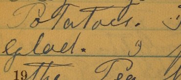
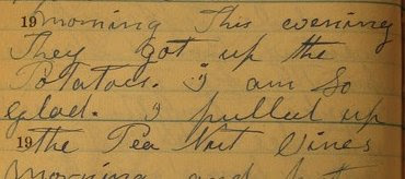
As a result, I'm shrinking the page images down by a quarter when they're added to the system. The resulting image is legible without much squinting. (See the sample above.)

These 480x640 images take up about half of the average modern monitor, so they're suited very well for a UI positioning the image on the right half of a webpage, with the textarea for transcriptions on the left half. They're also reasonably quick to load, even over a slow connection. They're not quite clear enough to resolve difficult handwriting, however, nor problems with the lighting when I took the original pictures. For that, we need to zoom.

In the original mockup created by my friend Blake Freeburg, as well as in the first prototype I wrote two years ago, a link appeared on the transcription page that reloaded the page with a higher resolution image. This provided access to the larger image, but had the same disadvantages (long wait time, ungainly UI) that comes along with larger image files.

The solution I've come up with is to provide a click-to-zoom interface. If a scribe can't read a part of the original, they click on the part they can't read. That will fire off an AJAX request including the coordinates they clicked. The server finds the next-larger-size image, crops out the section around the click target, and returns it to the browser. That will fire off an onComplete callback function to swap the standard-size image with the cropped version.


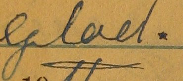
So in my example above. clicking the space after "glad." would return second image above. The user could then click an "unzoom" icon to return to the original low-resolution, full-page image, or click on the zoomed image to zoom again.


This would be the result of clicking on the zoomed word "glad" in the zoomed (second) image. This is a cropped version of the original five-megapixel image, and I think it's just as readable as the original document.

The advantages of this approach are a consistent UI and lower download times. Since some of my target users are rural or elderly, download time is a big plus.

The disadvantages come from possible need to pan around the zoomed image. My old colleague Prentiss Riddle has suggested using the Google Maps platform to provide tiled panning. This sounds elegant, but is probably hard enough to postpone until I have actual user feedback to deal with. There's also the possiblity that the server load for doing all that image manipulation will produce slow response times, but it's hard for me to imagine that the 45 sec needed to crop an image would take longer than downloading 1.5MB over a dialup connection.

Monday, April 30, 2007

Feature: Subject Indexes

One of the main goals of the diary digitization project is to create printed versions of Julia Brumfield's diaries to distribute to family with little internet access. The links between manuscript pages and articles described below provide the raw material for a print index. Reading storing page-to-article links in RDBMS record makes indexing almost, but not quite trivial.

The "not quite" part comes from possible need for index sub-topics. Linking every instance of "tobacco" is not terribly useful in a diary of life on a tobacco farm. It would still be nice to group planting, stripping, or barn-building under "Tobacco" in a printed index, however.

One way to accomplish this is to categorize articles by topic. This would provide an optional overlay to the article-based indexing, so that the printed index could list all references to each article, plus references to articles for all topics. If Feb 15th's "planting tobacco" was linked to an article on "Planting", but that Planting article was categorized under "Tobacco", the algorithm to generate a printed index could list the link in both places:
Planting: Feb. 15
Tobacco: Planting: Feb 15.

Pseudocode to do this:

indexable_subjects = merge all category titles with all article titles
for each subject in indexable_subjects {
print the subject title
find any article with title == subject
for each link from a page to that article {
print the page in a reference format
}
find any category with title == subject
for each article in that category
print the article title
for each link from a page to that article {
print the page in a reference format
}
}
}


Using an N:N categorization scheme would make this very flexible, indeed. I'd probably still want to present the auto-generated index to the user for review and cleanup before printing. Since this is my only mechanism for classification, some categories ("Personal Names", "Places") could be broken out into their own separate indexes.

Wednesday, April 25, 2007

Feature: Article Links

Both Wikipedia and Pepys Diary Online allow hyperlinks to be embedded into articles. These links are tracked bi-directionally, so that by viewing an article, you can see all the pages that link to it. This is an easy enough thing to do, once you allow embedded links:

UI

The text markup to insert a link needs to be simple and quick, yet flexible if the scribe has the need and the skills to do complex operations. The wiki link syntax used in Wikipedia is becoming common, so seems like as good a starting place as any: double braces placed around text makes that text a link, e.g. [[tobacco]] links to an article Tobacco. In situations where the link target is different from the displayed text, and optional display text value is supplied after a pipe, so that [[Benjamin Franklin Brumfield|Ben]] links "Ben" to the article on Benjamin Franklin Brumfield. This user-friendly markup can be converted to my intermediate XML markup for processing on save and display.

Another mechanism for inserting links is a sort of right-click dropdown: select the linked text, right click it (or click some icon), and you see a pop-up single-select of the articles in the system, with additional actions of creating new articles with the selected text as a title, or creating a new article with a different title. Choosing/creating an article would swap out the selected text with the appropriate markup. It is debatable whether such a feature would be useful without significant automation (below).

Storage

When text is saved, we walk through the markup looking for link tags. When one is encountered, it's inserted into the RDBMS, recording the page the link is from, the article the link is to, and the actual display text. Any link target articles that do not already exist will be created with a title, but blank contents. Reading this RDBMS record makes indexing almost trivial — more on this later.

Automated linking

The reason for storing the display text in the link is to automate link creation. Diaries in particular include a frequently-repeated core of people or places that will be referred to with the same text. In my great-grandmother's diaries, "Ben" always refers to "Benjamin Frankly Brumfield Sr.", while "Franklin" refers to "Benjamin Franklin 'Pat' Brumfield Jr.". Offering to replace those words with the linked text could increase the ease of linking and possibly increase the quality of indexes.

I see three possible UIs for this. The first one is described above, in which the user selects the transcribed text "Ben", brings up a select list with options, and chooses one. The record of previous times "Ben" was linked to something can winnow down that list to something useful, a bit like auto-completion. Another option is to use a Javascript oberserver to suggest linking "Ben" to the appropriate article whenever the scribe types "Ben". This is an AJAX intensive implementation that would be ungainly under dial-up situations. Worse, it could be incredibly annoying, and since I'm hoping to minimize user enragement, I don't think it's a good idea unless handled with finesse. Maybe append suggested links to a sidebar while highlighting the marked text, rather than messing with popups? I'll have to mull that one over. The third scenario is to do nothing but server-side processing. Whenever a page is submitted, direct the user to a workflow in which they approve/deny suggested links. This could be made optional rather than integrated into the transcription flow, as Wikipedia's "wikify" feature does.

Questions

In my data model and UI, I'm differentiating between manuscript pages and article pages -- the former actually representing a page from the manuscript with its associated image, transcription, markup and annotation, while the latter represents a scribe-created note about a person, place, or event mentioned in one or more manuscript pages. The main use case of linking is to hotlink page text to articles. I can imagine linking articles to other articles as well, as when a person has their family listed, but it seems much less useful for manuscript pages to link to each other. Does the word "yesterday" really need to link March 14 to the page on March 13?